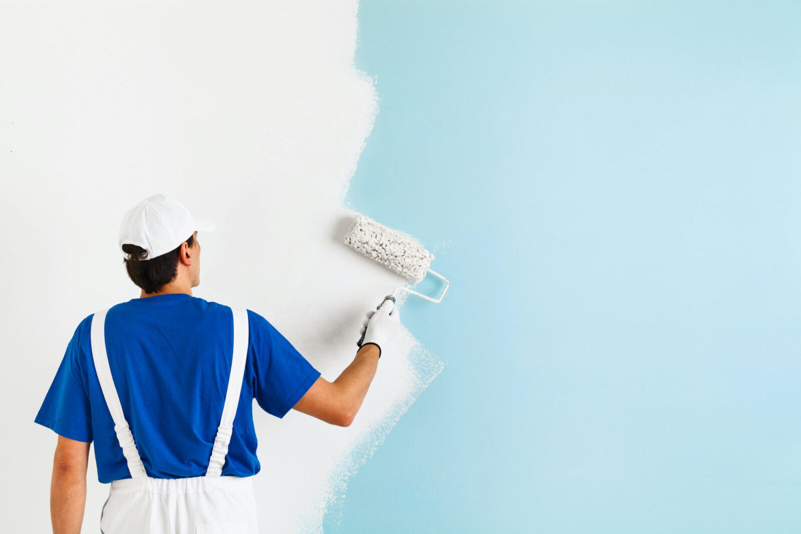
Are you looking for a few new paint colors to put in your home this upcoming year? Do you want more inspiration for ways to liven up your current layout? If so, then take a glance at these latest color trends for popular paint colors.
Exploring these trending tones for 2021 can help you get a year ahead of the curve. It’s a fantastic way for you to reimagine your spaces, impress your guests, and update your home from “late” to “great.”
Not to mention: All these months stuck indoors, you’re probably getting sick of looking at the same old floors and ceilings and walls. A fresh coat of paint might be just what you need to reinvigorate your love for where you live.
To give you some #inspo, we wrangled up some hot upcoming paint colors in the pipeline at Sherwin-Williams, that you can use to liven up your living spaces and bedrooms in the weeks to come.
Continuum

Over the years, neutral colors have gained more and more popularity as a gentle backdrop on which to make your mark with colorful pops of decor.
As a top Orange County real estate team, we always recommend neutral tones to our seller clients during the staging process. Neutral paint helps prospective buyers to more easily envision themselves living in the home, rather than be put off by a bold and very personal color choice like a rich purple or bright green.
Sherwin-Wiliams is predicting even more interest in neutral hues in 2021, albeit with a different flair! Their Continuum color palette is a perfect mix of wishful blues, yellows, and grays with a subdued energy. Following a set color palette is a great way to tie many different materials, fixtures and appliances in your room together.
Use it in your kitchen to blend stainless appliances with the classic outline and materials of your counters and cabinets. Paint it in your living room to breathe a cool and lively vibe into the space.

Sanctuary
Now more than ever, we could all benefit from a healthy helping of inner peace. Being stuck at home throughout a pandemic has made that difficult, with work and rest and school and meals all happening within the same four walls.
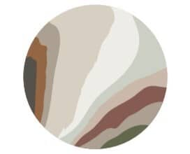
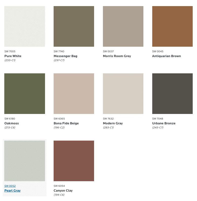
The new Sanctuary paint palette tries to capture the calming, peaceful respite that might be missing from your daily life, with a mix of earthy colors inspired by nature. It includes five different shades of brown ranging from dark to light, plus oakmoss green and various grays.
What may surprise you most is the versatility of this blend. It creates a comfy and welcoming vibe in any room that you paint it.
Use it in a guest room to welcome visitors with a cozy beige wall and matching furniture. Place it in your bathroom with white counters and cabinetry — it blends well with wicker baskets, wood floors, reflected in mirrors, and mingled with most common decor.
With all the stressful events of this past year, wellness is a priority. Paint these homey and earthy tones in your home to craft a peaceful retreat with a calming presence. It’s your great escape from the crazy, modern world.
For Orange County home sellers, these rich and pleasant hues are perfect to welcome potential buyers and make them feel instantly at home. They look great online, as well, which is a big plus for all the virtual home tours being hosted these days!
Tapestry

How about a blend of the modern serenity of neutral colors and the bold personality of 80’s acrylics? If that sounds up your alley, then the Tapestry palette is the perfect combination for you.
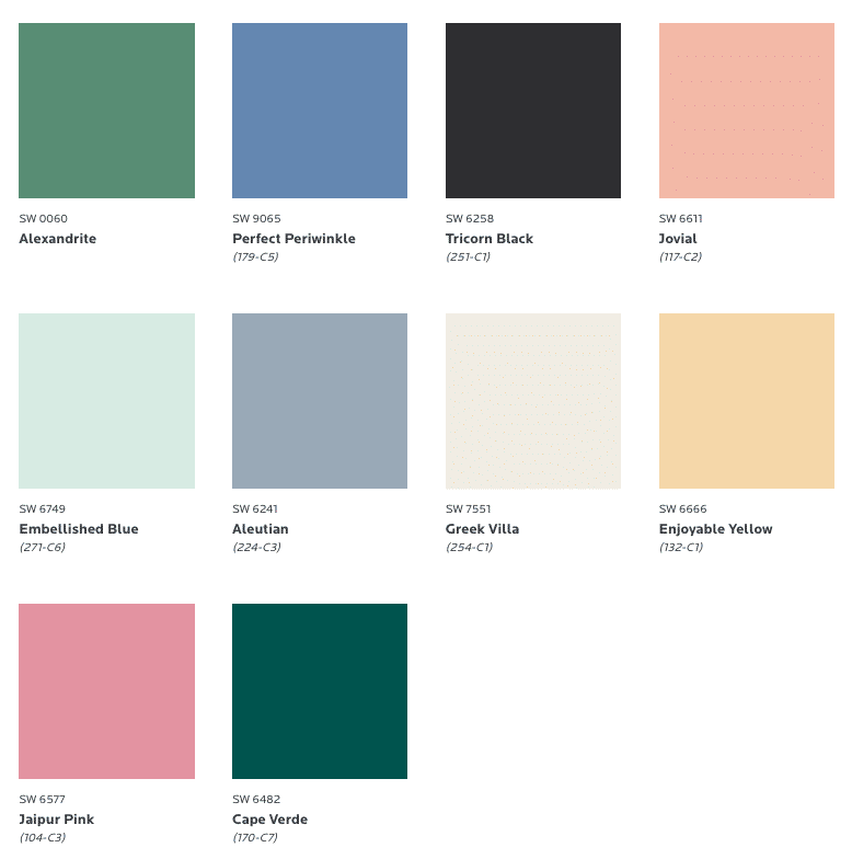
Tapestry features dark colors such as Cape Verde and Alexandrite Green, Tricorn Black, and Perfect Periwinkle. These darker hues are smoothly contrasted with more vibrant colors like Jaipur Pink and Enjoyable Yellow.
This is the ideal blend for anyone that’s looking to make a statement while maintaining a refined polish. These colors go great with interesting textures, patterns and textiles. Perfect Periwinkle is an ideal pairing with bold yellow material.
If you’re feeling handy, mix these colors together on a self-made feature wall. Use one more prominently than the rest to accent a living room, dining room, bedroom or bathroom.
No matter how you use it, you are bound to make a statement: there’s never a dull moment in your household. Tapestry exudes swagger and poise while remaining subtle enough to keep a warm and welcoming vibe inside your home.
Encounter
Perhaps because of the necessity of staying indoors so much of this year, Sherwin-Williams is doubling down on their offering of earthy tones in 2021.
Natural hues of brown and green offer an organic inspiration for peace and comfort. They exude a calmness that can help you escape the world around you. This makes them great colors for bedrooms, bathrooms, and anywhere else that you’d go for some peace and quiet.
Enter the Encounter painting blend, which features ten separate colors that tie together for a hearty helping of well-being and zen. Hues of Rosemary and Reddened Earth harken back to simpler times, to the beauty of nature and of handmade craft. These pair well a decorative clay pot, with your favorite houseplants, or with natural wood finishes.
Encounter is meant to help you capture the simple moments in life. It inspires introspection, to cherish the important experiences and heartfelt conversations that you’ll enjoy in 2021 and for years to come.

Earth Colors Reign Supreme
With all of these different color combinations in play for the year 2021, one thing is abundantly clear: earth tones are likely to be a very hot trend in interior design next year.
As we hope for health for our loved ones, safety in our communities, and a return to open society while the current year winds down, it makes sense that we would go back to basics with colors that connect us to the elements.
It may sound like a stretch, but color truly does inspire. The right palette in your home can help you foster a sense of calm, of community, of family and friendship. If you’re looking to mix things up, these color combinations can help you get in the right frame of mind for comfort and connection.
While you’re at it, consider the decor and furniture you already have in your house. Let that be your guide for the colors and composition that you select. You may be surprised how the things you already have can take on a new life and personality in a freshly painted environment.
Fight the Homebound Blues With Trendy Hues
Do these trending paint colors inspire you to change up your living spaces? We hope, at least, that they help you think about some simple improvements you can make to your home and your lifestyle.
If you are considering listing your home for sale and looking to spruce up its look before hitting the market, you might also be interested in our article on how to master real estate negotiations.
If you have questions on how best to position your Orange County home for sale, who to call for painting services, or anything else real estate related, feel free to contact us anytime! We are happy to lend our expertise on all things Orange County real estate.


